Case study
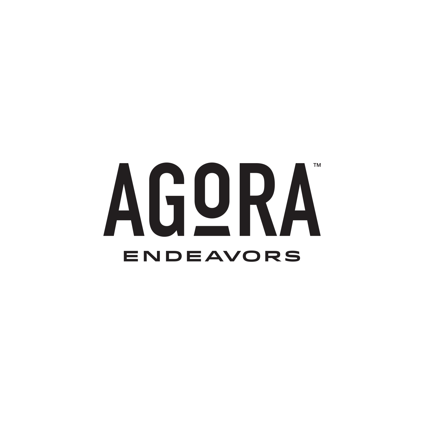
Agora Endeavors
background
Agora Endeavors is the parent company of two smaller organizations that help equip entrepreneurs and provide them with a strong like-minded community.
Challenge
As a parent company, Agora Endeavors wanted a logo that would compliment their pre-existing brands but also appeal to a more high-level audience.
Objectives
Agora Endeavors is:
Contemporary
Trustworthy
Solid
SOLUTION
- Clean and simple lines
- Strong/solid typeface with custom details
- Modern but timeless
- Sans serif font to compliment the existing sub-brands
- The "O" focal point represents the concept of the agora being the center marketplace where people gather to share ideas and conduct business
- The "O" and underscore also represents the head/shoulders of an entrepreneur and the emphasis of investing in the person behind the business
- The platform is also a subtle nod to the Pnyx, with rock steps leading to the agora


