Case study
Park Street BrethreN
background
Park Street Brethren Church is a family-oriented, Christ-centered church, that focuses on hospitality and loving their community.
Challenge
Park Street wanted a new logo that would represent a comfortable place where people don’t take themselves too seriously. As a multi-generational community, they wanted a modern mark with a timeless quality that would accurately represent their congregation.
Objectives
Park Street is:
Authentic
Practical
Welcoming
- Community-driven
SOLUTION
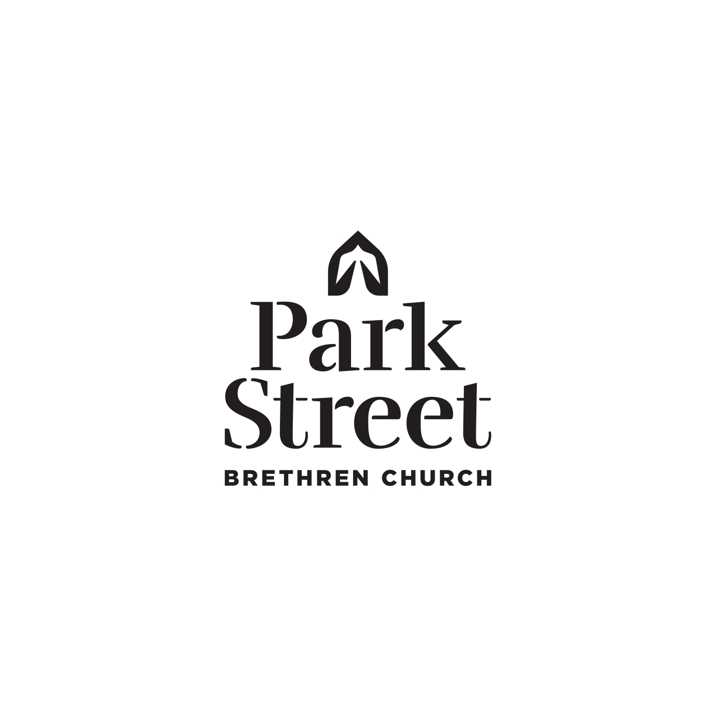
- A dove appears in the negative space representing peace & the spirit of God
- The green space surrounding the dove shows abstract hands coming together to represent community
- Shape mirrors the windows of the church building where people gather together
- Friendly and approachable type: Letters have slight stencil feel, representing broken people coming together to create something beautiful
MORE CASE STUDIES