Case study
MID-OHIO PIPELINE SERVICES
background
Mid-Ohio Pipeline Services is a main player in the underground utility construction industry. They specialize in the distribution and transmission of pipelines that allow for the transport of gas, water and other materials.
Challenge
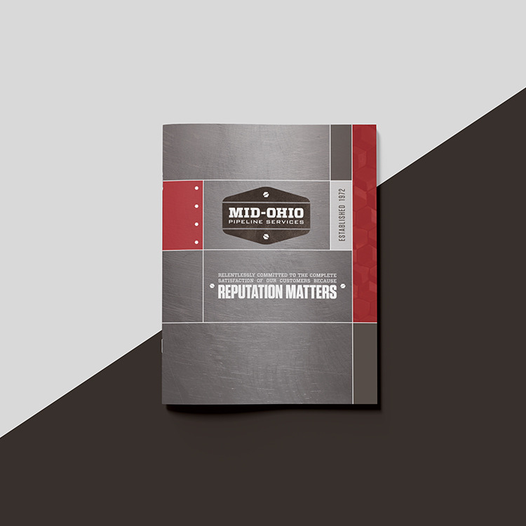
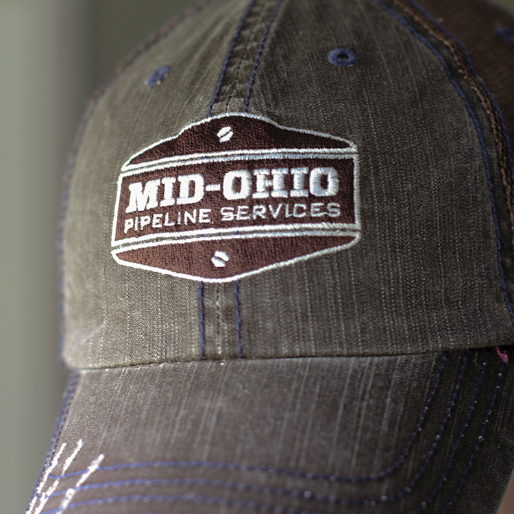
Mid-Ohio Pipeline was in need of an established brand presence to match their solid reputation. After years of using a variety of visuals, they wanted a logo that would encapsulate their leadership in the industry, made possible by their hard-working team.
Objectives
Mid-Ohio Pipeline values:
Integrity
Hard work
Leadership
SOLUTION
- Worn and rugged, representing old-fashioned hard work
- The shape embodies a classic American industrial heritage
- The brown implies reliability, approachability and wholesomeness
- Subtle texture creates an organic/natural undertone
